
You must log in or # to comment.
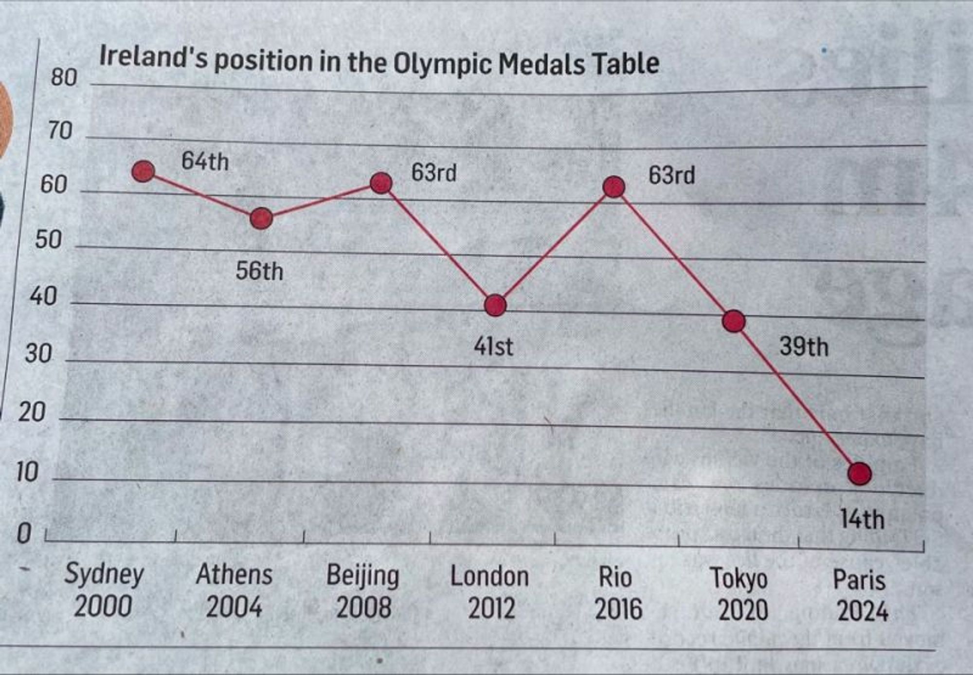
At this rate in 2028 they’ll be at -11th
If the article is about how just a few countries are dominating the podiums, I think this is an incredibly effective graph.
I like how the position axis starts at 0, maybe that’s for a year they don’t qualify
This reminds me of that chart showing gun deaths over a few years that showed the line going down the more deaths there were. That made sense graphically, they colored it in to look like blood dripping down, but this is just dumb.
The values are even incorrect. 2008, they got 63rd. 2024 they got 19th.